It's Time to Rethink Dual Monitors
I’ve had dual monitors in good use since 2011. Two workhorse 24” Samsung 1920 x 1200 resolution monitors to be exact. They were a huge improvement over my single 20” 4:3 ratio monitor they replaced. Yet, I always wished I could get a little more vertical space, due to the nature of the code editing I was doing.
I’ve had them in a couple of different configurations. I tried portrait, so I would have 1920 pixels of vertical space but ultimately decided that 1200 pixels across was a little too narrow. Of course, I also tried one portrait and one landscape, but that just made it awkward to flip applications back and forth.
For the last couple years, things felt especially cramped and I started exploring my options again. However, the only real upgrade path (based on price) was a WQHD resolution monitor which is a resolution of 2560 x 1440 pixels, typically sat in a 28” monitor size. You get a little more vertical, but it wasn’t a big enough leap to justify buying new monitors. Portrait *might* have been an option with WQHD, but – again – it was a little too narrow. 1920 seemed to be the minimum width that I would want.
The upgrade plateau I found myself in started to change with the advent of 4K monitors, but these were expensive. Within the last year, prices have started to come down. But in 24”, 27”, and 32” formats, squeezing in 4K requires that you do some scaling to be able to see anything. And if you scale up, you’re essentially making the viewable area smaller negating the space you could have gained with a 4K resolution.
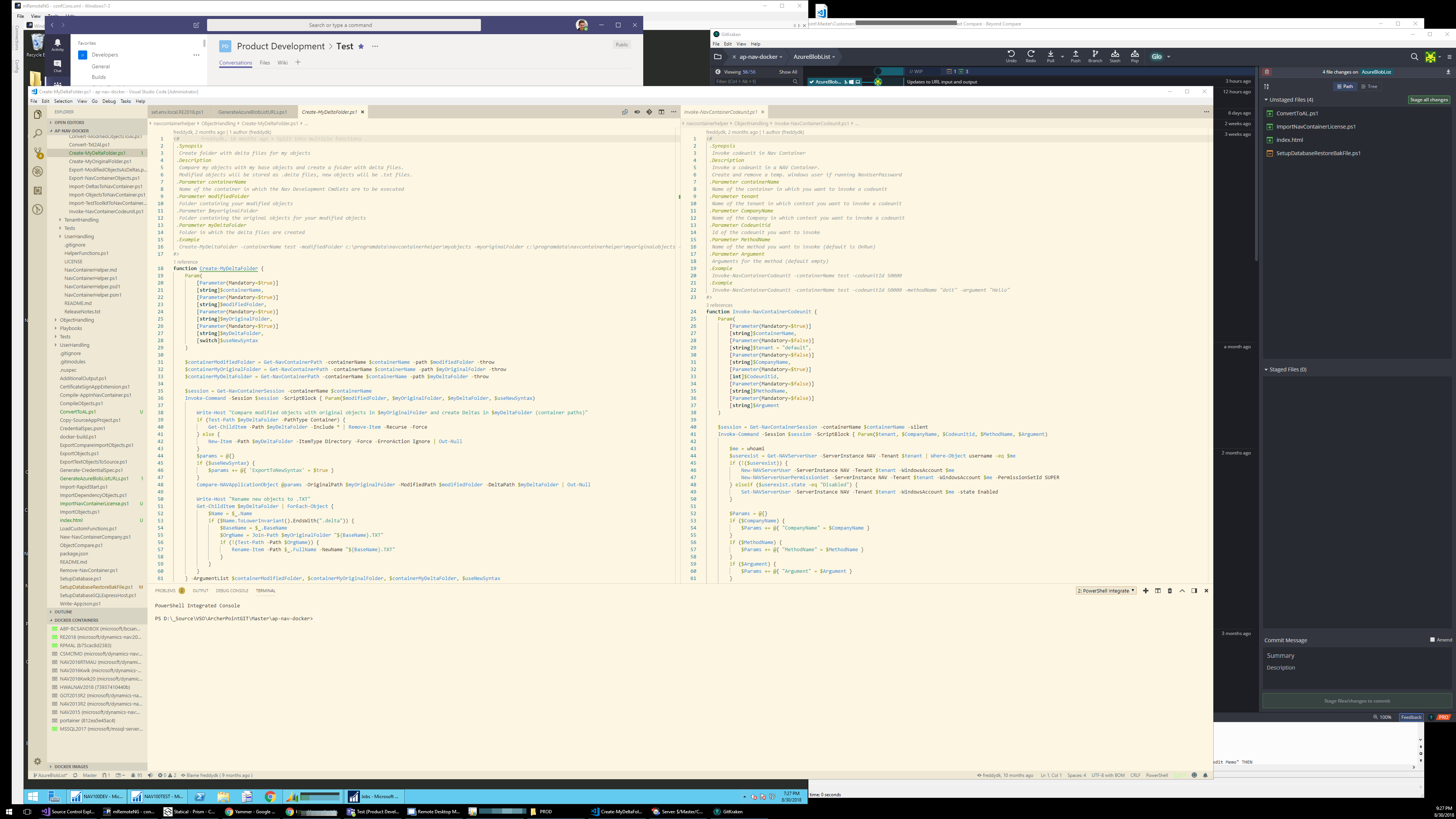
All of my new monitor calculus changed with the advent of a new class of 43” (Yes, forty-three inches!) 4K monitors. What if, instead of the tried and true dual monitors, I did one GIANT monitor? Space? 3840 x 2160! Scaling? Not with 43 inches of screen space! At 100%, 4K looks totally normal at this size. Cost? Equal or less than two WQHD monitors. The problem then is how to manage all of that space?
2160 vertical pixels solves my desire to have less up and down scrolling, but it would be a ridiculous number of total pixels if I were to stick with my one-application/one-monitor-at-a-time workflow. Certainly there had to be something to help manage the space (or so I thought!) in the same way that I needed something to help me manage multiple monitors 15 years ago.
Turns out I didn’t have to look long. Windows 10 has some nifty features that I’d probably seen and forgotten about. Snap and Resize. You can drag a window off to the corner or edge and it will snap to half or quarter of the window and allow you to pick the application that it will sit beside. If you want one of the windows a little bigger, you can select between them and both snapped windows can resize dynamically. There are several additional programs out there that enhance this basic functionality that can really help keep everything tidy.
In the end I found I didn’t really use any of the screen management features. I did keep one of my 24” monitors off to the side which is dedicated to email and IM. The only thing I have to watch out for is screen sharing. If I share the entire large monitor, it’s so small on the other end it’s not really visible. The single 24” monitor comes in handy for this or I just share the application and not the full screen.
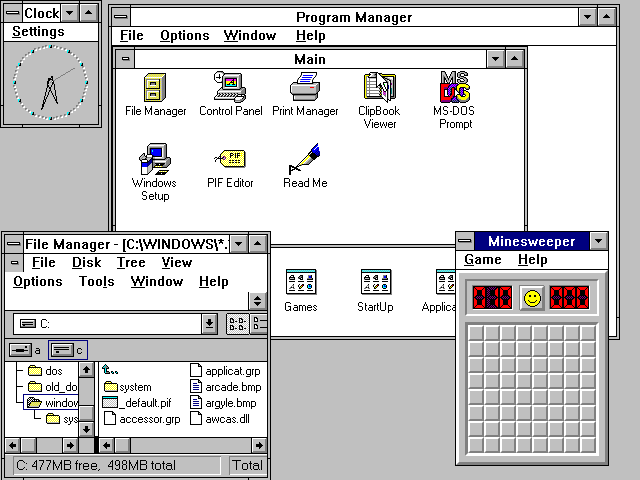
Otherwise, I find having one large monitor to split is less head turning than having two monitors with a bezel smack in the middle. The only thing I wasn’t anticipating was the “layering”. I expected to snap to 1920 horizontal pixels and then have another application set to an equal width to the side. What if I need just a little more width? Now I can resize a window to the space needed and move it to a spot where a little bit of the window will stick out from behind another. I can bring it back to focus by clicking a corner instead of heading all the way down to the task bar. Having just described that, it sounds like a Windows 3.1 nightmare and I certainly would have said as much before I made the switch.
Figure 1: Windows 3.1 Nightmare

Source: https://en.wikipedia.org/wiki/Windows_3.1x#/media/File:Windows_3.11_workspace.png
I’ve found it works well and if the monitor died on me tomorrow, I would order another one once I was able to see through the tears. Each application is sized to what I need at the time and it’s way more flexible. Surely this is what they had in mind with the name “Windows.”
